Oil & Gas Moved Through Interstate Transmission Pipelines 2006-2016
Pipelines are a safe and reliable method of moving oil and gas to those who rely on it
Oil and gas moves safely through interstate transmission pipelines. This graphic shows that over 99% of resources are delivered without an incident.
Hover over the labels to see the percentages for both groups.
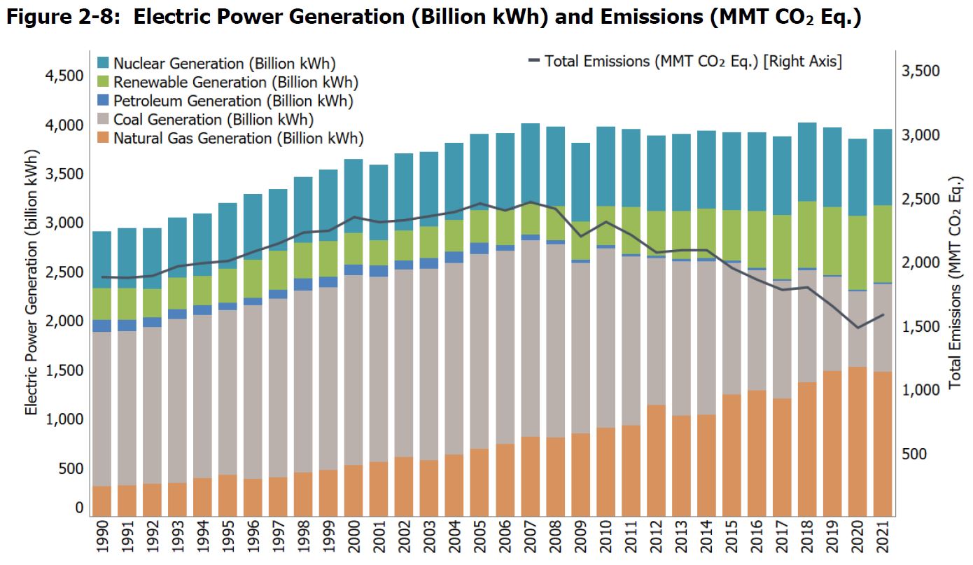
Electric Power Generation & Emissions 2000-2019
Increased power generation from natural gas has helped reduce total U.S. emissions
Each bar represents the mix of power generation sources used per year. The line chart illustrates total greenhouse gas emissions in Million Metric Tons C02 equivalent.
Hover over the visual to see data for each year and power generation source. You can select and deselect items in the legend to change the perspective of the graphic. By changing the items in the visual, you will notice the direct correlation between decreased use of coal paired with increased use of natural gas, creating an overall decrease in total emissions over the years.
In God we trust. All others must bring data.
Oil & Gas Sector Methane Emissions 2000-2030 (MMT CO2 Eq.)
Emissions are projected to decrease by almost 75% from 2020-2030
The yellow bars represent projected emissions in a sustainable development scenario. From 2000 to 2020, there is a constant growth in emissions, but from 2020 to 2030, projections show a drastic reduction in emissions.
Hover over each bar to see the exact number of emissions each year.
US Methane Emissions from Energy 1990-2019 (MMT CO2 Eq.)
Natural Gas & Petroleum Systems have seen consistent decreases in methane emissions since 1990
The data used here shows methane emissions in the United States from the energy sector. We see that natural gas and petroleum emissions have been steadily decreasing since 1990.
Projected Employment in Midstream Oil & Gas Industry 2015-2035
Projections show increased employment of over 60,000 workers
This visual shows historical and projected employment numbers in the midstream industry, forecasting an increase in employment in the next 15 years.
To view the employment numbers for each year, hover over the specified bar in the chart.
U.S. Oil & Gas Industry Employment Projections by Select Demographics 2015-2035
The Midstream industry shows increased employment in select demographics and industry segments
Taking the data from the previous visual, this one breaks down employment by industry segments and demographics. One sector that is projected to have consistent growth in employment in each demographic is skilled blue-collar workers.
Interact with the legend to see the change in employment for each time period.
Injury & Illness Incidence Rates U.S. Oil & Natural Gas Industry vs. Other Industries 2011-2020
The oil and gas industry is consistently lower than the other industries during this time period
Safety is a top priority in many industries, so we compare the injury and illness rate per 100 oil and natural gas workers to other industries. The injury and illness rate in the oil and natural gas industry is below average.
There are many ways to interact with this visual. Hover over a line to see specific details about each industry. You can also change the aspect on which you view the lines by clicking “scores” or “ranks” at the top of the graph. To stop on a specific year, hover over the visual and click on the year you want to investigate.
Environmental, Social & Governance Risk Atlas
The midstream industry is average in social and environmental risk compared to others
Each bar in the chart represents two types of risks: environmental and social. The midstream industry is in the middle, showing it has an average social and environmental risk compared to other industries. Midstream’s scores are comparable to those of retail and leisure.
Social risk is associated with relationships, community impact, human rights, workplace health and safety, diversity and inclusion, and political ties.
Environmental risk looks at an industry’s utilization of natural resources and the effect of its operations on the environment, both directly and indirectly.
To view one risk set at a time, select or deselect from the legend below the x-axis.
Primary Energy Consumption 1635-2021
Since 2000 Petroleum and Natural Gas have accounted for over 50% of primary energy consumption
Each line represents a type of primary energy consumption in the United States from 1635 to 2021. We started using most of today’s primary energy sources beginning around 1850. Natural Gas and Petroleum consumption have increased consistently since the start of their use.
There are many ways to interact with this visual. Hover over a line to see specific details about each industry. You can also change the aspect on which you view the lines by clicking “scores” or “ranks” at the top of the graph. To stop on a specific year, hover over the visual and click on the year you want to investigate.
Join the Conversation
Take Action